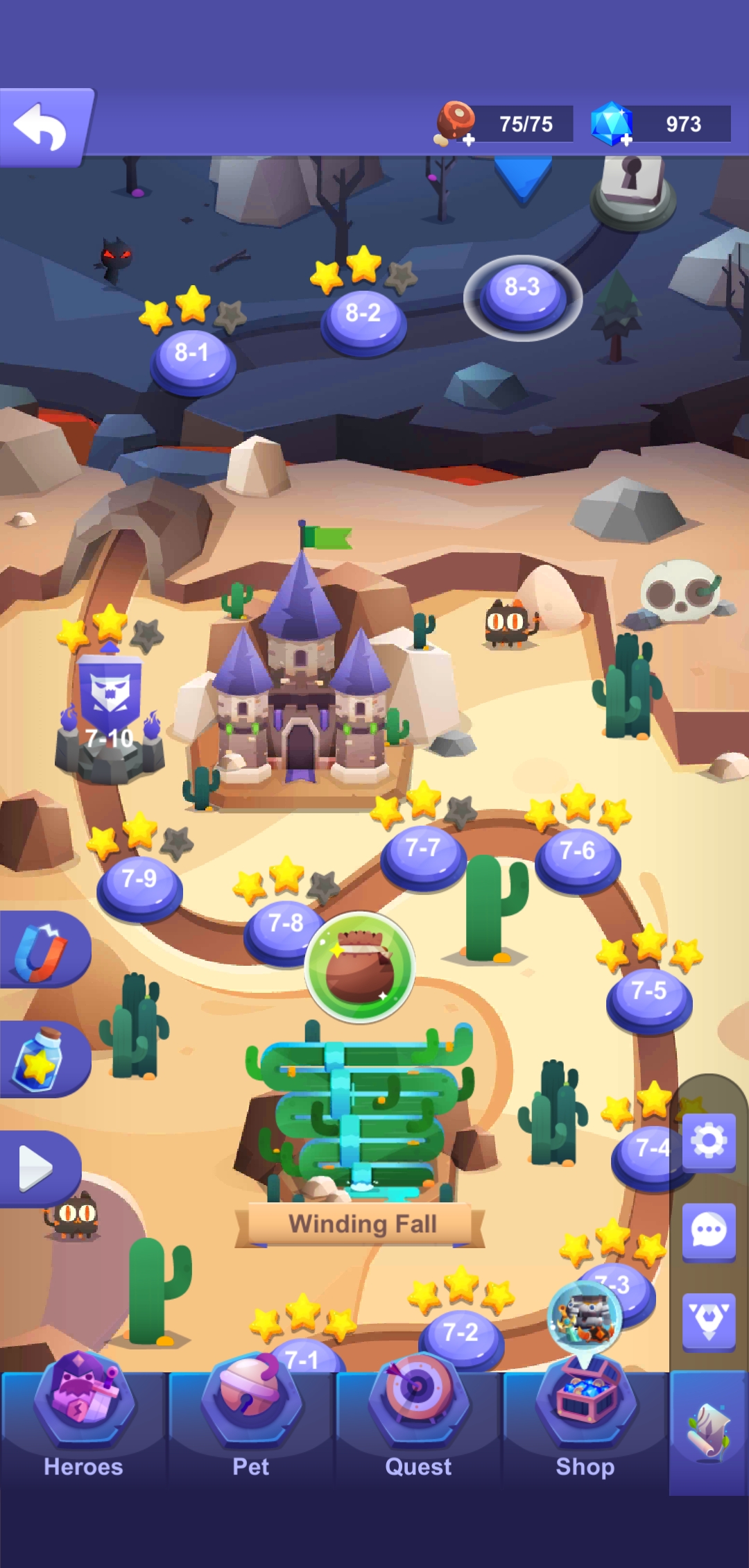
At the top of the screen, there is some blank unused space (approximately the width of the bar containing notification icons and clock, etc…)
At the bottom is another space about the width of the bottom menu buttons (circle, triangle, square)
The spacing leads me to think that the icons, clock, bottom menu buttons are intended to remain visible, but aren’t. Perhaps remove the blank spaces while working on a solution? (Would be nice to see more adventure map at once)
Android 9
Model: OnePlus 6T
OS: Oxygen 9.0.12
Hi @Meterian, do you mind to send me a screenshot? We’ve done some optimizations to the tall Android devices because a lot of the models now have a ‘front camera’ blocking the top middle part of the screen.
So as you can see in my photos, the space at the top is unnecessary. My device is seems to be hiding the notch itself, by placing a black bar at the top of the screen to hide the notch.
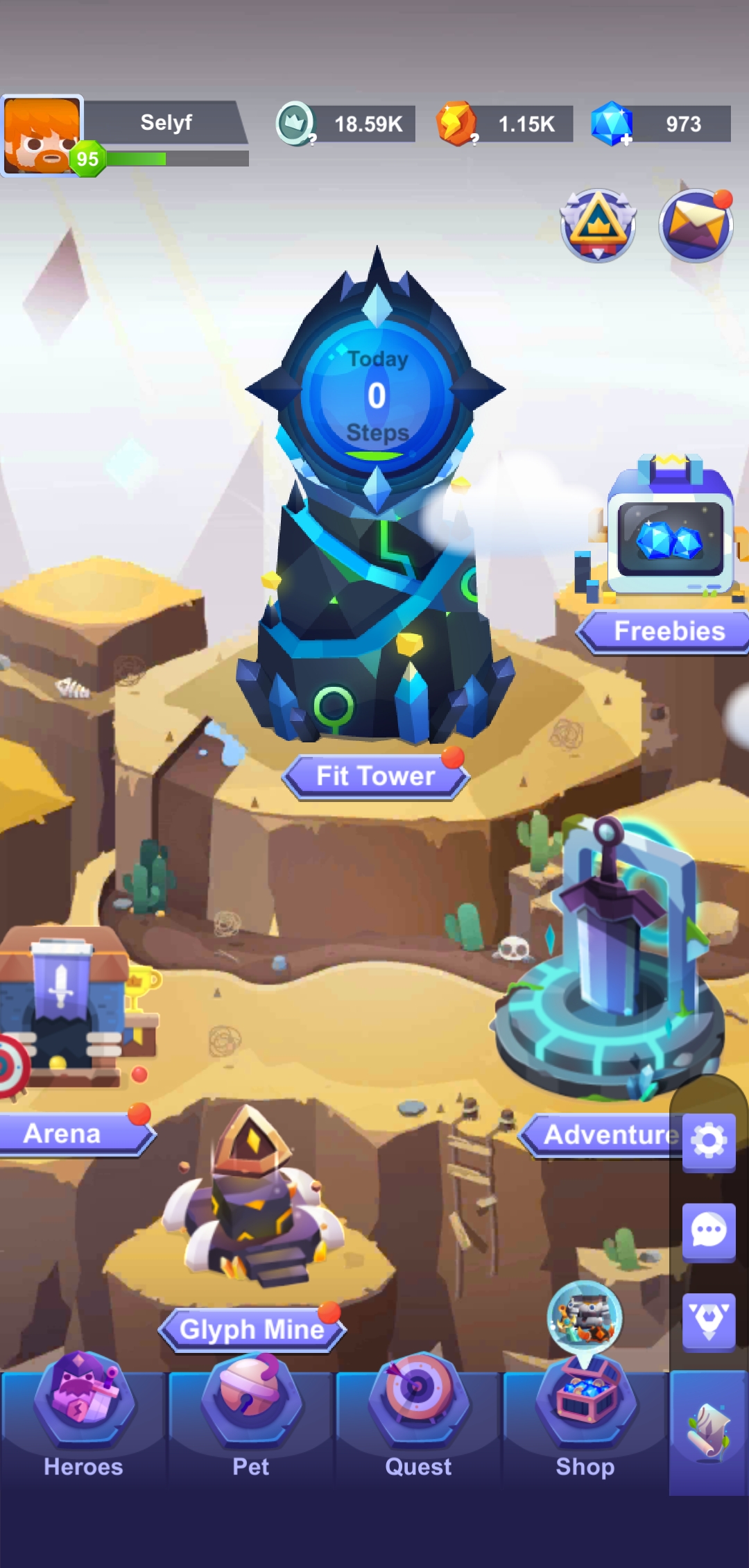
The bottom menu does sometimes appear at first, but entering the tower or adventure area causes it to hide. Going to the multi-app screen and back (square button) causes the same thing.
1 Like
I prefer a small phone and rushed to buy an iPhone SE last year to make sure I have a lady-pocket sized phone while it was still in production. Anyway, what I mean to say is: the game looks great on smaller screens. Hope that doesn’t change